Chicago Communities
Who can live in Chicago?
--
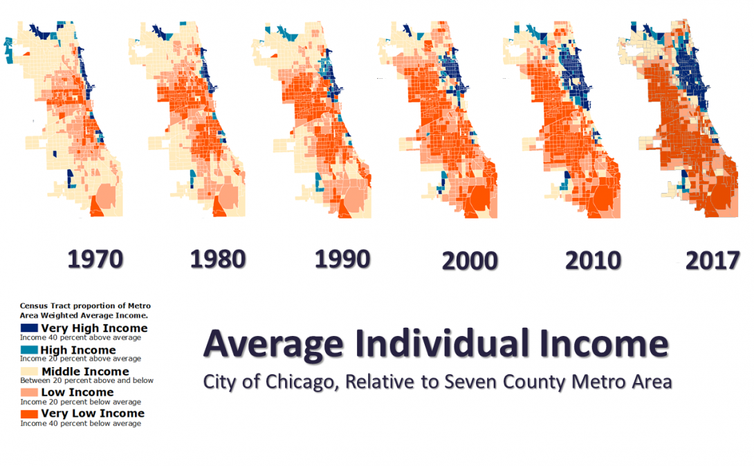
In response to the growing income inequality in Chicago, The Nathalie P. Voorhees Center analyzed change in income in the seven-county Chicago Metropolitan Region from 1970-2016, assessing each Census Tract’s average per capita income relative to the region at different points in time. Chicago’s neighborhoods fall into three groups, called “cities” based on income change from 1970 – 2017. As our study illustrates, Chicago has grown more segregated by income over time and losing its middle class. We then analyzed the three cities in regard to other factors, such as race, age, disability, housing tenure, and employment.
--
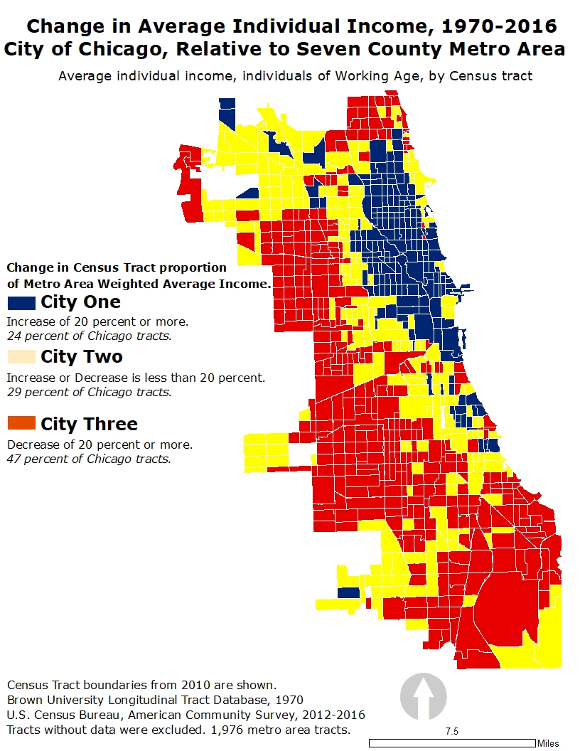
Conducted in 2016, the Three Cities study analyzed change in income in the seven-county Chicago Metropolitan Region from 1970-2016, assessing each Census Tract’s average per capita income relative to the region at different points in time. As our study illustrated, Chicago has grown more segregated by income over time and continues to lose its middle class.
The Three Cities defined by this study are as follows:
- City One includes all Census Tracts that increased their proportion of regional income by 20 percent (622,099 people);
- City Two includes all Census Tracts that increased or decreased their proportion of regional income by less than 20 percent (770,277 people); and
- City Three includes all Census Tracts that decreased their proportion of regional income by 20 percent (1,344,751 people);
The following tabs will speak in more depth regarding the characteristics of each city.
--
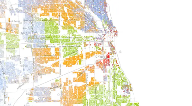
Between the years 2010-2016*, City One gained over 43,000 white individuals and lost over 5,000 African American individuals. In stark contrast, City Three’s African American population decreased by nearly 60,000 individuals, and City Two’s African American population decreased by nearly 16,000 individuals.
--
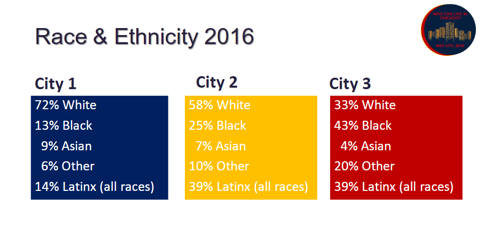
Chicago’s “cities” are rife with large racial disparities. In City One, the most racially homogenous city, more than two-thirds of current residents are White. In contrast, City Three is most distinguishable for its racial diversity, where no racial group composes more than half the population. City Two, which is predominantly White, is a quarter Black. In both City Three and City Two, the Latino population just borders 2/5 of the total.
--
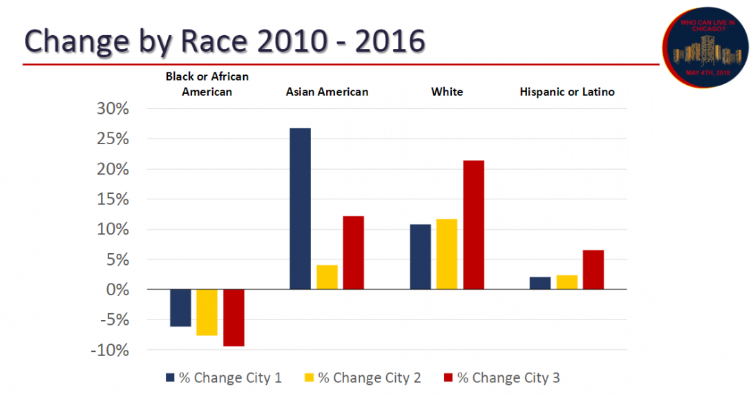
Within Cities One, Two, and Three, population by race has trended significantly for all racial groups throughout the past several years. Between 2010-2016, the most significant trend within in a racial group consisted of a 27% increase in the Asian American population in City One. Second to this change was the increase of the White Population in City Three (21%). The Black population in Cities One, Two, and Three lost population across the board, showing strong evidence of the mass Black exodus that Chicago has experienced over the past decade. The hemorrhaging of the Black Population in all three cities also marked the only racial group that experienced a decreasing trend in any city, let alone all three.The Latino population grew faster in City Three than any other city.
These trends become even more important to watch when we look at income. In 2016, more than one-third of City Three’s African American population earned less than $20,000, and more than half earned less than $35,000. In City One, 45% of the white population earned more than $100,000. In fact, within Chicago overall, nearly 70% of households earning more than $100,000 were white, while more than half of households earning less than $20,000 were African American.
--

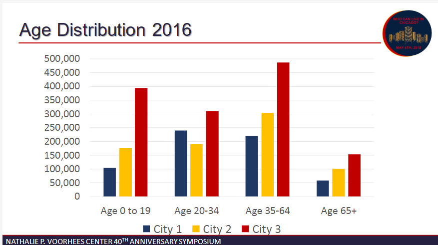
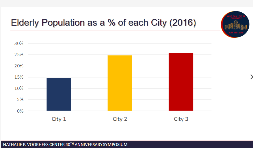
Akin to racial trends, age segregation has been growing steadily in Chicago over the past five years. Nearly four-fifths of Chicago’s children live in City Three. Furthermore, City Three also contains the largest elderly population (26%), as well as the largest population of person between the ages of 35-64 (60%).
Among all White people identified between ages 0 and 19, roughly the same percentage live in City One and City Two (40 percent and 39 percent, respectively). The most prominent age group living in City One are millennials. 57 percent of White people identified between the ages of 20 and 34 live in City One.
Households with children under 18 are higher in City Three than City One or Two. This is across married, single-householder, and non-family households. Trends show that married households with children are increasing in City One, while married households and single female householders with children are decreasing in City Three.
--
The American Community Survey estimates that 10.6% of Chicago’s total population has a disability that impacts their basic functioning (difficulties with hearing, vision, cognition, walking, self-care, and/or independent living). Throughout the City, much higher portions of the elderly population live with a disability than working age adults and children. When analyzing across all three age groups, City 3 has higher rates of disability than the citywide rate.
City 3 is home to 49.8% of Chicago’s total population, but home to 58% of Chicago’s total population of persons with disabilities. More than two-thirds of Chicago’s children with disabilities live in City 3, even though City 3 is only home to 60% of the overall population of children. Furthermore, more than a third of Chicago’s elderly population lives with a disability, half of which lives in City 3.
This raises important questions about how resources are distributed in Chicago to support children with disabilities. Are schools, parks, childcare centers, and after school programs in City 3 neighborhood accessible? Do they have adequate public resources to make accessibility improvements and provide quality programming for children with disabilities? City 3 also has the lowest labor market participation rates and highest unemployment rates. Do public and community-based job training programs have the capacity and staff expertise to work with job-seekers with disabilities? We must seriously consider how these neighborhoods are served and planned in order to ensure that seniors and seniors with disabilities can lead active and health lives.
--
—
--

The American Community Survey estimates that 10.6% of Chicago’s total population has a disability that impacts their basic functioning (difficulties with hearing, vision, cognition, walking, self-care, and/or independent living). Throughout the City, much higher portions of the elderly population live with a disability than working age adults and children.
When analyzing across all three age groups, City 3 has higher rates of disability than the citywide rate. City 3 is home to 49.8% of Chicago’s total population, but home to 58% of Chicago’s total population of persons with disabilities. More than two-thirds of Chicago’s children with disabilities live in City 3, even though City 3 is only home to 60% of the overall population of children. Furthermore, more than a third of Chicago’s elderly population lives with a disability, half of which lives in City 3.
This raises important questions about how resources are distributed in Chicago to support children with disabilities. Are schools, parks, childcare centers, and after school programs in City 3 neighborhood accessible? Do they have adequate public resources to make accessibility improvements and provide quality programming for children with disabilities? City 3 also has the lowest labor market participation rates and highest unemployment rates. Do public and community-based job training programs have the capacity and staff expertise to work with job-seekers with disabilities? We must seriously consider how these neighborhoods are served and planned in order to ensure that seniors and seniors with disabilities can lead active and health lives.
--
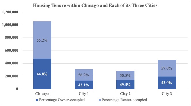
Housing affordability is an issue for many of Chicago’s households. Households are considered “cost-burdened” by the U.S. Department of Housing and Urban Development if they spend more than 30% of their income on housing costs. Between 2010 and 2017, the percentage of cost-burdened households decreased in Chicago overall from 48% to 40%. However, stark differences lie between cities in both housing cost-burden as well as housing tenure.
The majority of Chicago’s 1,055,000 households rent their homes (55.2%). In Cities 1 and 3, renter-occupied housing constitutes approximately 57% of all occupied housing units. City two illustrates more parity between renter- and owner-occupied housing, where renter-occupied housing represents only a slight majority. City 3 has the highest share of population within Chicago, and likewise, has the highest shares of both owner and renter households. This is in contrast to City 1, which is home to the lowest share of owner households. These figures are more significant when housing cost-burden is factored into the equation.
As expected, the concentration of cost-burden households is highest in City 3, where per-capita income has decreased the most drastically since 1970 and where growing concentrations of children and elderly persons reside. In all three cities, a larger portion of renter-households are cost-burdened in comparison to owner households. However, a sharp degree of severity lies between City 3, where more than half of all renters are cost burdened (55%), and City 1, where one-third of all renters are cost-burdened (36%). This is especially concerning if we consider City 3 is the poorest, and it has the highest concentration renters and number of families with children and elderly households in Chicago.
High rates of housing cost-burden in both City 3 and City 2 suggest that many families have fewer financial resources for food and clothing for children and aging family members. Without more affordable rental options or affordable ownership opportunities, many households in City 2 and 3 are likely to face increasing economic hardship and may decide to look for more affordable housing markets elsewhere in the region and beyond.
--
--
Unemployment
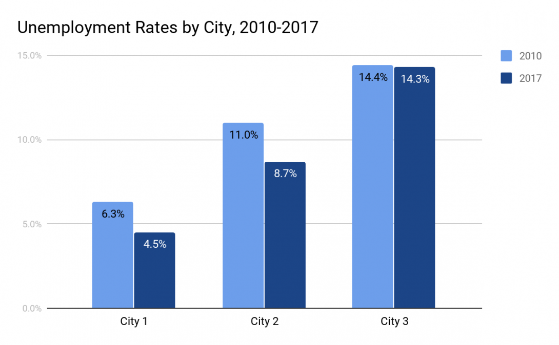
Between 2010 and 2017, Chicago’s unemployment rate (the percentage of labor force participants who did not have a job, reported looking for work in the previous four weeks, and were currently available for work) dropped from 11.3% to 9.9%. However, disparities in unemployment rates between City 3 and Cities 1 & 2 grew between 2010 and 2017. The unemployment rate for the labor force living in City 1 had fallen to 4.5% from 6.3%, while in contrast, the unemployment rate for the labor force living in City 3 remained above 14% in 2017, more than triple the unemployment rate of City One. The labor force living in City 2 also experienced a substantial decrease in its unemployment rate.
--
Labor Force Participation
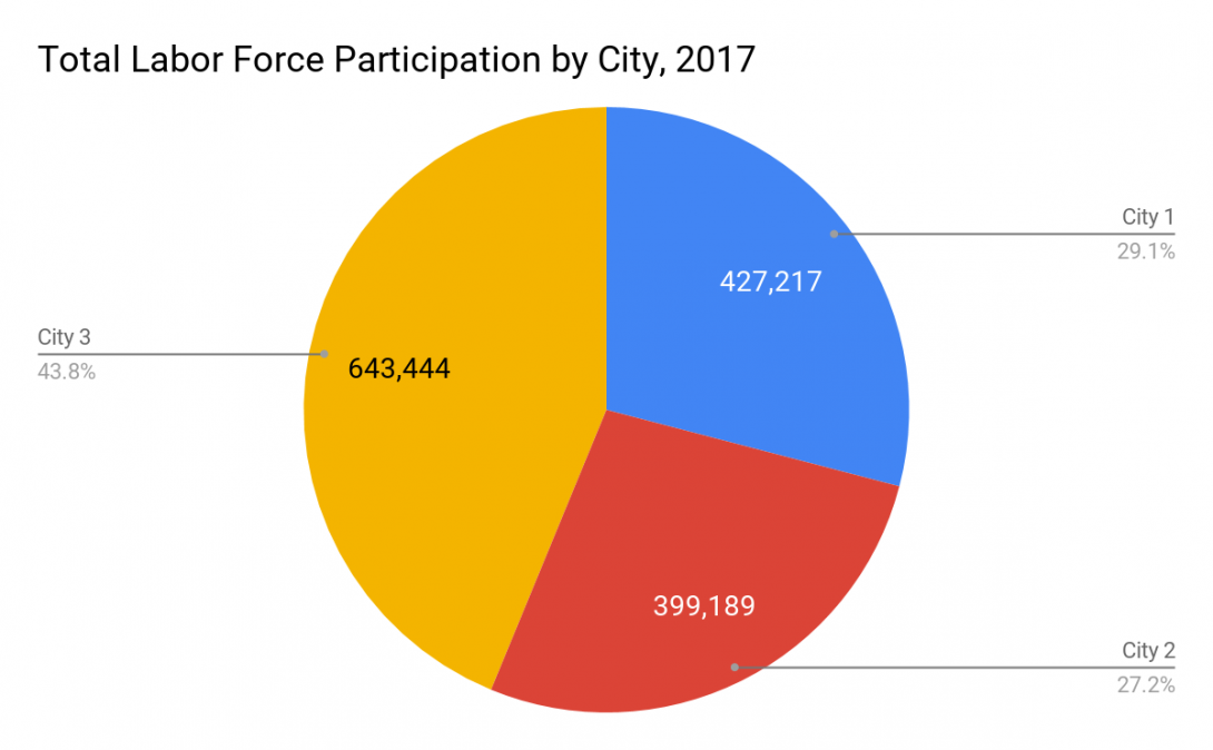
In 2017, 1,469,850 Chicago residents were participating in the labor force (this includes people who are employed and unemployed). Almost 44% of Chicago’s labor force lived in City 3 in 2017. In 2017, City 1 had the highest labor force participation rate in Chicago. That is, of all the working age people living in City 1, 77.4% were either working or looking for a job. By contrast, the working age population living in City 3 had the lowest labor force participation rate (61.3%). Labor force participation rates are displayed for each city in Figure 2.
--
Trades by City
According to data from the Census Bureau’s Longitudinal Employer-House Dynamics (LEHD) by 2017:
City 1 was home to the highest concentration of workers employed in Finance and Insurance (10.4%), and Professional, Scientific, and Technical Services (17.9%).
City 2 was home to the highest concentration of workers employed in Educational Services (10.7%).
City 3 was home to the highest concentration of workers employed in Manufacturing (8.7%), Retail Trade (10.8%), Administration & Support, Waste Management and Remediation (10.4%), Health Care and Social Assistance (15.0%), and Accommodation and Food Services (10.6%).
Labor Force and Trades by City
Not surprisingly, City 1 has the highest labor force participation and lowest unemployment rates in Chicago. City 1 is also home to the highest concentration of workers in the Finance and Insurance sector, as well as the professional, scientific, and technical services sector of the economy. Workers from City 1 are also the most likely to work in the city and work in or around the central business district.
City 2 is home to the smallest portion of Chicago’s labor force when compared to Cities 1 and 3. While its unemployment rate has decreased substantially since 2010, its labor force participation rate (65%) is much lower than City 1. City 2 has the highest concentration of workers in the Educational Services sector compared to Cities 1 and 3, and also a high concentration of workers in the Health Care and Social Assistance sector.
City 3 has the lowest labor force participation rate of the three cities. Furthermore, its 2017 unemployment rate remains high (14%). Those who can find work are more likely to hold primary jobs in low wage sectors like Retail Trade and Food and Accommodation Services. Workers in City 3 are also more likely to travel outside of the city for their primary jobs.
Worker Flows by City
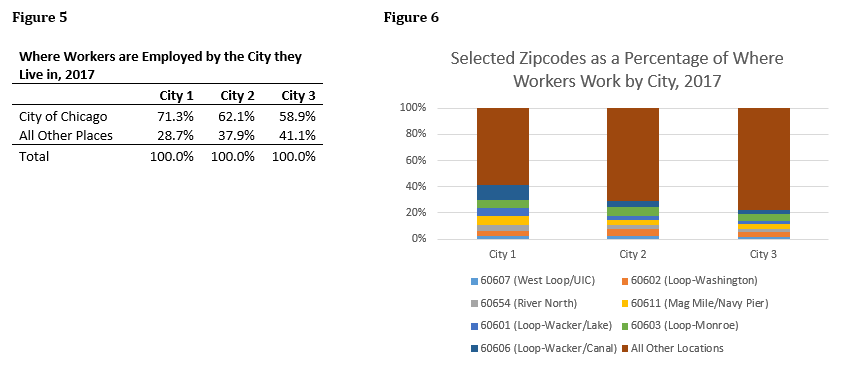
In 2017, large portions of employed workers in all three cities relied on jobs all over the city and its surroundings. Workers living in City 1 were the most likely to hold a primary job located in Chicago (71.3%) when compared to workers living in City Two (62.1%) and City Three (58.9%). Further, almost 40% of workers living in City 1 had primary jobs located in and around Chicago’s Central Business District (the Loop). While workers living in City 2 and City 3 were also concentrated in the Loop, the vast majority worked in other locations.
--
—
--
Following a method created by the University of Toronto Centre for Urban and Community Studies, we found an average income for the Chicago seven-county region for six time periods, and then divided the per capita income of each census tract by the corresponding regional average income of that time period. Next, we identified five income categories to describe how the census tract’s average income compared to the region’s aggregate average income.
As illustrated by our research, between the nearly fifty-year time period, poverty and wealth has substantially increased while middle-income earning populations have largely declined.
Please click here for a summary worksheet that can be used for events, lectures, or classroom guides. Please click here for a Q & A Fact Sheet regarding the project, and here for a downloadable, animated depiction of income change in Chicago throughout the past 50 years.